Category Archives: TUTORIALS

Storytelling and exploration

IMG_2235

This post is a little peek into my thought process and editing method. Like most other dabblers in some form of art or another, I have developed through the years something that I feel is my personal style and have built a workflow that enables me to attain the results I want without going crazy or broke.

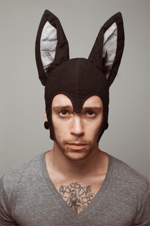
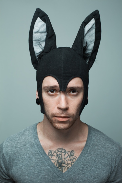
I had the pleasure of shooting again with lovely Tanya and she arrived bringing her boyfriend Seth, a couple of suitcases of stuff and, totally randomly, this bat hat. As she was getting her make up done, I started to test the light: while I normally use the model (i.e. if I need to check on how the clothing/makeup looks under the lights) we took a couple of portraits of Seth wearing the hat just to have a laugh and then moved on to serious business.

Here it is, static pose and “why me” expression typical of boyfriends worldwide.
IMG_2235

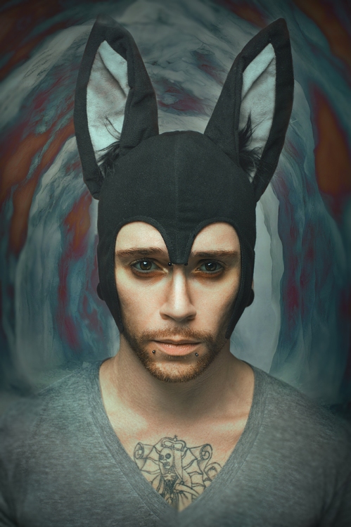
Fast forward a couple of weeks later, I’m working on a completely different project and after a day spent editing wedding photos I decide to take a break and sort through my personal shoots: the first couple of photos that pop up from Lightroom are the bat hat ones and there was something in there that I didn’t see when we were taking them: maybe the fact that it was 2 am, but my first thought was “here’s a guy who’s having a really bad trip”, followed by “let’s make it even worse”… I just had to decide what was happening to my subject and why.

Setting the scene
Lately, I’ve been trying more and more to incorporate storytelling elements into my photographs and I found that finding an answer to the classic Five W of journalism is the best way to have a clear direction towards the final result. This method is easy to do on your own and it scales well in team projects because once the character and situation is decided, everyone involved has a clearer insight on what to do to obtain that particular result.
Workwise, I always start with Lightroom: in this case, I tweaked the RAW file colour balance to obtain a bluish tint, desaturating the skin in the process, then moved on to Photoshop for the real work.

IMG_2235

The outside mirrors the inside
I wanted to show that the young man in the shot had been lost in his personal world for quite a while, detached from reality both in mind and in body, so using a couple of underground cavern shots I assembled a corridor made of jagged edges of a sickly blue and red palette enveloping him like an aura. The hat and gray shirt reminded me the costume worn by Max in the “Where the wild things are” book (and the fact that I have a row of figurines from WtWTA displayed next to my workstation only heightened the idea), so the editing had to make him look more vulnerable and childlike.
The eyes are always the focus of headshot portraits for me, so I am particularly picky on how I edit them. In this case, the eyes/sockets had to match the two colours of the background without being too over the top, so red puffy eyebags and sunken in bluish eyes were a natural choice.

bah

Keeping content-coherent
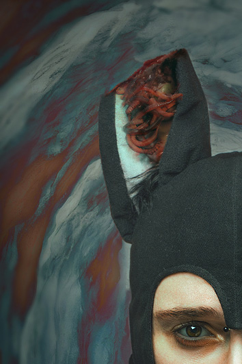
I briefly toyed with the idea of giving him a badly torn ear: the colours, wavy lines and haunted stare started to remind me of the Van Gogh self portrait. I know I wanted something gorey and disturbing, so I started googling infected wounds and worms. The results were starting to look hideous (in a good way) but I found out that the ear was stealing the show as my eyes were constantly looking towards that portion of the shot, obscuring the face… that to me was a definite no, as the eyes were my focal point, so I scrapped the levels and went back to the whole ear.
The risk is getting lost in unnecessary details just because they look good rather than aid the storytelling: no matter how good it might have turned out, it would have resulted in a weaker portrait.

IMG_2235-2

Never forget your beginnings
Before I close everything up and export it, I usually spend a couple of minutes away from the computer and then once back I cycle through all the levels and groups, looking one last time to see if the choices I made are coherent. That’s when I decided to add a blurriness to the edges of the shot to enhance the “woah, he’s tripping” effect as well as a slight vignette to (guess what?) steer the attention towards the eyes.

A fun not to close this rambling post: the original title I gave the photo was simply “Bad trip”. However, without having told him about my work process, Seth called it “Where the wild things are on a bad trip”… nerd telepathy or just having hit the mark with what I wanted to show? You decide!

Leave a comment

Filed under PERSONAL, PHOTOGRAPHY, PHOTOSHOP, TUTORIALS

Glitched!

After working so much on “serious” shoots where both the concept and the mood were solemn and composed, I wanted to have a bit of fun and experiment so I decided to combine two of my loves (hair and old school computer art) into a single project. So starting with a poppy colour palette, add 90ies era kitsch graphics (those have been making quite a big return into mainstream culture lately!) and a sprinkle of glitches to the girl with the softes hair ever and you have the recipe for “Glitch!”.

These got picked up by Dye Magazine and are featured in their latest issue.

Model: Valentina Tafferini
Styling: Videnoire

glitch01

glitch04

A little bit of background on how I went about making the graphic/glitchy part of these images. As an 8bit aficionado, I am naturally drawn to all things pixely but I particularly enjoy glitch art as it’s the punk rock of computer art: it’s all about destroying/corroding a pristine file, repurposing it in order to send a different message from what it was intended to originally.
There are plenty of online resources (such as this one) where you can simply enter a file and watch as it gets randomly glitched, but I prefer to make mine from scratch by opening the image code in text edit and effing it up big time… tons of fun in what you can enter (do not simply cut and move bits around, you also enter text or glitch the image several times around!) and the random element of what actally comes out is always a fresh point of inspiration to me.
The resulting images were then used for sampling (along with a series of channel mixes) so that I could pick and choose what I liked -because “random” is such a nice word but it clashes with my obsessive “I want that red pixel cluster to be just THERE!” method of work.

glitch03

glitch02

Leave a comment

Filed under PHOTOGRAPHY, PHOTOSHOP, TUTORIALS

Necronomicon nails

Secondo capitolo delle mie manicure libresche. Stavolta è un classico: Necronomicon – The best tales of H.P. Lovecraft
Io adoro Lovecraft… la mia tendenza alla logorrea si trova perfettamente nel suo stile che per molti invece è troppo ampolloso; la cosmogonia che ha creato è stata fondamentale per parecchi autori considerati al giorno d’oggi come i massimi esponenti di horror, fantascienza e fantasy…. ed era un amante dei gatti per cui di default vince tutto.

02

Ho svariate raccolte e saggi di mr L. ma questa versione omnibus recuperata in un bookshop londinese e imbarcata a mano al ritorno perchè non stava in valigia è perfetta per farsi una maratona di disgrazie cosmiche (altrui), tentacoli e orrori inenarrabili… certo, bisogna chiudere un occhio sul lettering atroce del titolo, un Papyrus deformato a causa della lunghezza del nome, ma considerando che il Necronomicon è un libro fittizio scritto da un pazzo yemenita, il Papyrus è ancora una scelta ammissibile. 😉

03

Se si parla di Lovecraft si parla di Chtulhu. E se si parla di Chtulhu si parla di tentacoli. Ho ripassato lo smalto nero di base con pennellate di nero glitterato argento per dar più materia al disegno.

04

Orrida qualità fotografica, purtroppo, dato che ho usato a)una digicam compatta del secolo scorso e b)ho scattato mentre facevo colazione, ergo in modalità provvisoria.

05
01

Leave a comment

Filed under BOOKS & NAILS, NERDINESS, PERSONAL, PHOTOGRAPHY, TUTORIALS

Golden butterfly

Per fortuna che all’estero il nostro paese è conosciuto come “sunny Italy”, perchè sembra di stare a Seattle: tutti i fine settimana, da un mese a questa parte, sono stati incredibilmente piovosi…. quasi ovvio, dato che avevo in programma solo scatti all’aperto! Tuttavia, per ogni legge di Murphy c’è sempre una scappatoia… la soluzione stavolta è stata scattare nel bel mezzo di settimana scorsa (quando il meteo era ottimale) anche se ha significato delle corse non indifferenti per riuscire ad uscire a un orario decente e soprattutto sopravvivere al traffico da ora di punta milanese. 😉

In un mondo perfetto, saremmo andati a scattare in un campo fiorito… peccato che oltre a rendere impossibile stare all’aperto per tutti gli esseri sprovvisti di branchie, le trolling rains hanno provveduto a cancellare dalla faccia della Terra buona parte dei fiori per cui la scelta è ricaduta su un bosco artificiale che, come abbiamo presto scoperto a nostre spese, era soprattutto un enorme allevamento di insetti photobomber e ragni assatanati.

Scleri metereologici e insettofobi a parte, stavolta ho approfittato del lusso di avere ben due assistenti e ho trovato il tempo di sfruttare la Mark II anche per fare qualche video: da un po’ di tempo volevo mettere insieme una sorta di backstage/workflow e visto che il weekend scorso è stato nuovamente piovoso, il risultato è stato questo: una serata di scatti e circa 40 minuti di editing in meno di 3 minuti. Enjoy!

Per quanto riguarda le foto: due set al prezzo di uno… tramonto in mezzo ai campi scattato con flash e foresta (in mezzo agli insetti) con luce naturale. Ancora una volta, la modella è miss Cleo Viper, il trucco è merito di Claudia Malavasi, mentre hanno avuto una pazienza infinita a starci dietro ai nostri scleri Francesco e Andrea Tosi.


13 Comments

Filed under PHOTOGRAPHY, PHOTOSHOP, TUTORIALS

Black Beauty

Sempre in ballo con gli esperimenti…  stavolta ho fatto un po’ di prove sull’illuminazione e l’editing della pelle di colore. Il genere di foto che prediligo porta sempre come condizione sine qua non una pelle alabastrina -quando non è direttamente truccata per apparire cadaverica. Complice anche la mia natura fotofobica e decisamente anti-sole, non ho spesso modo di fotografare gente che non sembri appena uscita dai tunnel dei Morlock. Per fortuna, una sera sul tardi ho attaccato bottone con la splendida Dineo (prova vivente che sulla linea 90-91 non girano solo ceffi orrendi) che gentilmente mi ha offerto un pomeriggio del suo tempo per sperimentare, insieme ad Archa che si è occupata del make up.

Lo schema di set up luci:

Ed ecco lo scatto:

Fotograficamente parlando, mi sono accorta che la pelle non caucasica si comporta diversamente per due motivi:

-I toni più scuri daranno luogo a ombre molto più pesanti… dove uno si aspetta sfumature, trova immediatamente il nero totale. A seconda dei casi, questo può giocare a favore (ad esempio per ritratti low key) ma per beauty luminosi dove le ombre servono al massimo a dare volume, devono essere alleviate almeno da un pannello… toglierle del tutto necessiterebbe di una seconda luce quasi alla stessa potenza della principale, molto di più di quanto necessario per una pelle chiara.

-Anche se la pelle che appare a occhio nudo perfettamente matte, quando viene colpita dalla luce è molto più riflettente per cui si creano aree di lucido (in questi scatti, le braccia ad esempio non sono truccate e presentano l’effetto naturale della pelle)… sono sinonimo con pelle sana/luminosa e spesso mi trovo ad aggiungerle in post su pelli più chiare che sono luminose in modo uniforme, per cui bonus da quel lato. L’altra faccia della medaglia è che il viso andrà corretto di conseguenza perchè altrimenti rischia di avere delle aree sovraesposte ed è molto più facile andare a bruciare, specie se si mettono luci radenti… anche in questo caso, è una cosa che potrebbe essere sfruttata: il 95% delle foto di rapper o atleti fanno uso di rim lights dato che facilmente comunicano potenza e coolness: esattamente il contrario di quello che volevo rendere con Dineo, infatti l’unica luce di rim è fatta dal pannello e serve a delineare la mascella in modo da staccarla meglio dal collo in ombra.

Per quanto riguarda l’editing, la pelle non caucasica ha una quantità di rosso più elevata, per cui si fa molto alla svelta a virare lontani dalle tinte cioccolato e a finire nel reparto ustionati. Una seconda difficoltà è appunto data dalla necessità di mascherare in modo realistico eventuali zone troppo luminose, complice anche la texture della pelle che ha pori più grandi e più definiti… questo significa che lisciarla troppo dà un effetto che è ancora più innaturale che su una pelle europea (che ha pori più sottili e ravvicinati).
Un’ultima cosa: negli occhi, l’iride è quasi completamente nera e si perde con la pupilla, il che significa che è molto facile avere un’effetto demoniaco/alieno se non si sta attenti. Avere catchlights bene in vista aiuta a mantenere una parvenza di umanità e aiuta a leggere l’espressione.

7 Comments

Filed under PHOTOGRAPHY, TUTORIALS